Cooler Master H500P Mesh ATX Case Review
Pros
Eye-catching styling; excellent airflow; competitive price; clean interior design; non-proprietary RGB lighting
Cons
Plastic front fascia; sub-par hard drive mounting system; glass panel only removable with a screwdriver
Rating
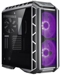
Here at The Tech Buyer’s Guru, we always start our case reviews by noting that we’ve reviewed more PC cases than any other category of product. With this review, we’re now up to 22 and counting (we have another one sitting here waiting for review, as it happens). So you could say we have a pretty good sense of what makes a great case, and where the simply average cases fail.
When we first saw the H500P prototype at PAX West 2017, we knew that Cooler Master was on to something. In the end, the first-gen H500P wound up having a few critical flaws (including disappointing airflow), but in truly honorable fashion, Cooler Master owned up to these failings and prepped an improved H500P, dubbed the H500P Mesh, just six months after the release of the original H500P (which is being discounted in advance of being discontinued). In a world where many sub-par case models live on for years, we really have to hand it to Cooler Master for not taking the easy way out.
And that brings us to the MasterCase H500P Mesh you see here. This model is so new that it’s not even for sale yet, although the H500P Mesh White hit the stores a few weeks back. That being said, we’ve received clearance from Cooler Master to publish this exclusive review, as the H500P Mesh differs from the H500P Mesh White only in color (it comes in the gunmetal grey of the original H500P).
So what makes the H500P Mesh so much better than the original? Well, the first improvement is obvious: the mesh! Indeed, Cooler Master kind of goofed up with the original design, going for style more than substance by placing a solid acrylic panel right in front of the H500P’s twin 200mm front intake fans. With the Mesh, you get unimpeded airflow to and through those giant fans. Other improvements include minor details like a latch on the front panel (which flips forward to expose the fans), a screw to hold on the top panel (which previously could be knocked off easily), and an improved power supply mount. But what does all this add up to? Is the H500P Mesh a great case? Read on to find out!
Special thanks to Cooler Master for providing us a sample of the MasterCase H500P Mesh as well as the MasterLiquid ML240R Liquid Cooler featured in this review.
Description and Features
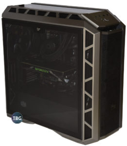
The first thing you notice about the H500P, before even turning it on, is its size. It measures 21.3″ tall, 9.5″ wide, and 21.4″ deep. By modern standards, that’s pretty big, but honestly, it feels (both literally and figuratively) pretty well proportioned. We’ve seen a number of cases that are unusually tall (and feel top-heavy), or unusually long (and therefore have a huge footprint), but Cooler Master has done a great job with this case. Take note that it has nearly identical height and depth measurements, which we think contributes to its proper sense of scale. And while the H500P is a handful, it’s not inordinately heavy, in part because much of its exterior is clad in plastic, which we’ll discuss further a little later on.
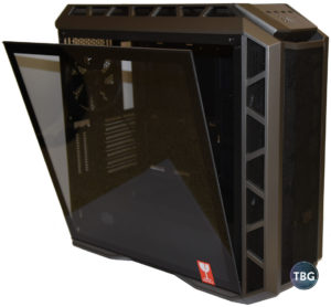
Once you get past the size, your eyes will undoubtedly turn to the large tempered glass panel adorning the left side of the case. Some may scoff at the trend towards tempered glass in cases, given its fragility (note the “Fragile” sticker on the window as it comes right out of the box!), but honestly, we wouldn’t have it any other way. If you’re going to use a side window on a case at this point, go glass or go home. There’s simply no place for acrylic in today’s market. Yes, it’s light, and no, it doesn’t shatter easily, but it scratches at the slightly touch, and we’ve had far too many expensive cases be reduced to worthlessness due to scuffed acrylic side windows. Glass is really hard to scratch, and now that manufacturers have figured out how to package these cases so they don’t shatter in transit, they are the only option when it comes to showing off a case. By the way, another advancement we’ve seen in the past six months or so is more innovative glass mounting methods. Whereas all first-gen tempered glass panels used four screws to affix them, which slowed down access to the PC and required manufacturers to drill multiple holes in glass, which no doubt was tricky, the H500P uses a convenient rail to hold the lower edge of the panel. In the case of the H500P, you can actually tip the glass out and leave it there, at least temporarily, as shown in the accompanying photo.
Now, that doesn’t mean everything is perfect with the H500P’s design. First and most glaringly, the single latch on the glass panel could have been so great, save for the fact that it’s extraordinarily tight and requires a flathead screwdriver to operate. Any guesses as to what will happen over multiple attempts to open this glass panel with a flathead screwdriver? Yeah, it’s kind of like taking a chisel to a window. Cooler Master, if you’re listening (and we know you are), please, please, make a running change to your inventory to source a rubber-coated thumb screw that will allow users to operate this without the need for a sharp tool!
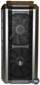
Of course, no high-end modern case can get by without a little RGB in the mix, so let’s dive into the RGB effects of the H500P Mesh. As it turns out, they are limited to the front fans (no RGB strips are included), but the great news is that Cooler Master is the very first manufacturer that we know of to introduce a full line of RGB fans that are fully compatible with the industry-standard RGB header on all modern high-end motherboards. SilverStone has done something similar with its RGB fan grilles, Phanteks allows it with an extra-cost adapter, and Thermaltake allows it on its ultra-premium cases, but Cooler Master is bringing truly usable RGB to the masses with its H500P Mesh, and we applaud the effort. It takes some courage to make a case that allows consumers to buy accessories from competitors. NZXT and Corsair, are you listening?
Given that they are a defining feature of this case, we think it’s only right that we provide a bit more insight into the MF200R RGB fans used in this case. They most definitely aren’t just for looks. These twin 200mm monsters serve up copious amounts of air, unimpeded by any solid front panel (which is all too common on high-end cases today, not just the original H500P). While a few other companies have offered cases like this in the past (notably the Corsair Obsidian 750D Airflow with its twin 140mm fans, the Phanteks Enthoo Pro with its single 200mm fan, and the SilverStone PM01-RGB with its triple 140mm fans), the H500P Mesh really makes a statement with its two spinners behind that mesh curtain. They provide massive airflow at low noise levels – our samples spun at a maximum of 790RPM and 825RPM respectively, and produced just 47dB from a six-inch distance, which is quite incredible given the amount of air they can move. Furthermore, because they require very low RPMs to achieve their maximum airflow, they have a very clean acoustic signature. Noise is experienced by humans as more than dB, it’s also pitch and variance, and these are some of the best fans we’ve ever heard in these regards. Note that in classic Cooler Master fashion, the bearing type of these fans is not specified, but based on the life expectancy ratings and the relatively low $20 retail price per fan, we believe they use sleeve bearings. That’s not necessarily a premium option, but at this size, and when oriented vertically rather than horizontally, this type of bearing can be very quiet over time, even if it won’t last quite as long as a fluid dynamic bearing.
Assembly
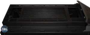
Putting a system together in the H500P is straightforward. The interior is very spacious, with plenty of room for large coolers above the motherboard. As shown here, our liquid cooler is hidden away in the roof of the system, keeping it out of the way of cables, RAM, and heatsinks). The power supply area also had ample space for our 170mm-long Corsair unit, and installation was made easier thanks to the removable slide-in mounting system.
But there is one exception to all this good news. To be frank, Cooler Master has really goofed up its handling of SSD and hard drive mounting. First, it mounts the two included 2.5″ brackets on top of the power supply shroud, as shown below, which is very trendy nowadays, but a huge pain to actually use. We tried mounting our 2.5″ Crucial SSD in one of these brackets, and the cabling was a nightmare, simply because SATA power cables don’t bend all that easily right at the junction of the connector and the cable. That’s a universal problem with all cases that use this silly design (which we think NZXT “pioneered”), but luckily, we could remove the two brackets and attach them to the back of the motherboard tray, where they worked perfectly. Who really needs to show off their 2.5″ SSDs anyway?

Then there are the 3.5″ drive cages, shown to the right in the photo above, which on their own would be fine. But Cooler Master mysteriously designed them to slide in from the front, where you have zero access! To actually use these cages, you have to remove three interior panels (the big rear cable cover, the front cable cover, and the hard drive bay cover. It’s a needlessly complex solution, given that you actually cable these drives from the open rear of the cage. It’s as if Cooler Master was trying to come up with the ultimate Rube Goldberg machine for hard drive mounts! We did mount one of our SSDs in this area just to figure out how it worked, and then immediately removed the cage entirely from the chassis. That’s the best part of the design: you can throw it out if you’re not using it!
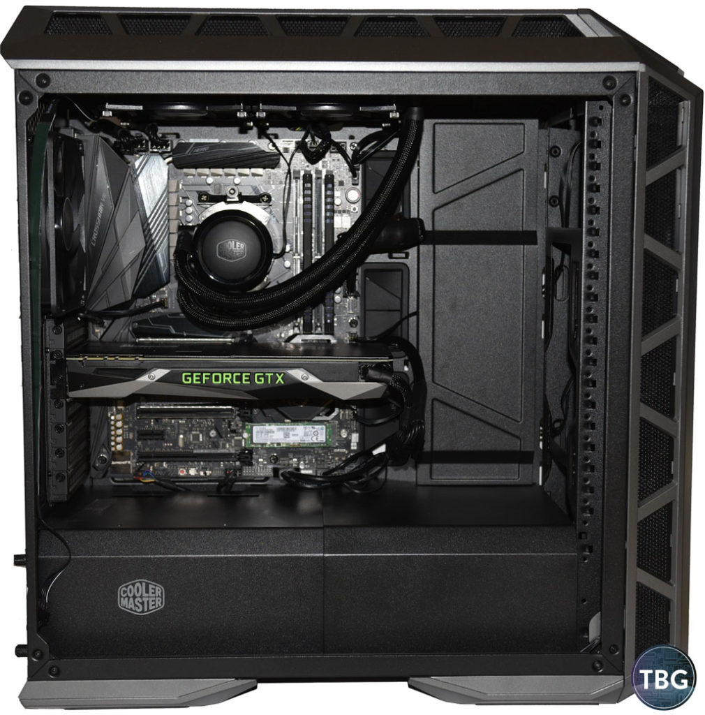
Overall, we like that Cooler Master has “shrouded” the PSU and drives, even if the implementation isn’t perfect, as it provides a clean look to the main interior compartment. But you can have everything buttoned-up in front, while a wild party is going on in back. But Cooler Master has come up with a very neat solution for managing the mess of cables in the back of a case behind the motherboard, which can often lead to difficulty installing the side panel. It’s added a removable cover to this area. We’ve provided a montage of photos below to show you just how neat this turns out:
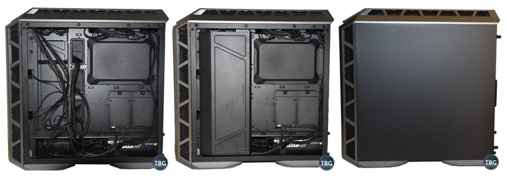
Yes, indeed, it’s like magic. We love this idea, and it’s a clear indication that Cooler Master has bigger plans for this platform: a windowed right-side panel is obviously in order for an upgraded version of the H500P! By the way, note how neatly our 2.5″ SSD mounts to the back of the motherboard. Remember, this is not the out-of-the-box configuration, but it certainly is infinitely better! Speaking of out-of-the-box, keen-eyed readers will be able to spot what isn’t in this box… we’ll give you a hint, we mentioned we tossed it a few paragraphs up!
Aesthetics
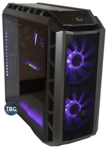
We’ve already provided plenty of photos of the H500 Mesh, but we’ll give you one more to show what it looks like when you get all your RGB lighting set up and running off the motherboard’s built-in controls. You’ve probably decided by this point whether you love or hate RGB, and the H500P’s looks specifically. Personally, we love it all. But then again, we tend to like our PCs to sport starship themes rather than refrigerator themes, despite the fact that a refrigerator-themed case happens to be the best-selling case in the world. To each their own, right?
In the photos and video you’ll see here, we’ve dressed up the H500P Mesh with additional RGB lighting, courtesy of several other components: the awesome new MasterLiquid ML240R Liquid Cooler, SilverStone’s LS02 RGB light strips, the Asus X470 Crosshair VII motherboard (which has both 4-pin RGB and 3-pin addressable RGB headers), as well as Corsair’s sweet Vengeance RGB DDR4-3000 RAM. All of this gear can be sync’d using the Asus Aura software to allow for some truly slick lighting effects. RGB may have its fair share of critics, but RGB done right can turn a PC into a work of art, and fully-integrated RGB controls are key to making that possible.
We ought to provide a bit more insight into the sleek MasterLiquid ML240R Liquid Cooler that Cooler Master provided us. We’ve already tested this cooler’s predecessor, the MasterLiquid 240, and you can see how it performed in our liquid cooler shootout. In short, it’s a very good mid-range cooler, although perhaps just a step behind the best 240mm models. That being said, this new ML240R is most definitely a step ahead when it comes to aesthetics. It’s the very first AIO cooler that uses fully-addressable RGB lighting in both the cooling block and the fans. What exactly does addressable mean? Simply put, each RGB LED can receive its own indepedent signal, and while that doesn’t mean you can actually program each one independently, it does mean that any pattern you apply to a system will apply to the device in question, so for example, if you set the PC to rainbow, you’ll get the full rainbow all at once in the addressable device. Our video below shows what happens when we apply a pink-blue gradient to our PC – the ML240R displays the entire range all the time! Note that you really need a motherboard with an addressable RGB header, like the Asus X470 Crosshair VII motherboard we used. While Cooler Master has included a work-around solution for use with a breakout box, it’s incredibly complicated, and we couldn’t bother testing it. For builders of new PCs willing to do their homework to get an addressable-capable motherboard, however, the ML240R is a perfect choice.
If you’re not a fan of RGB lighting, you probably couldn’t care less about this innovation, but we think it’s incredibly cool. By the way, the only thing we were disappointed about was that there wasn’t more visible lighting coming through that top acrylic panel, as can be seen in the photo below. Because the RGB lights in the cooler fans face downwards (if properly installed in an exhaust orientation), you basically get no light coming through that top panel. In future (more expensive?) versions of the H500P, we’d love to see Cooler Master pre-install some RGB light strips in that top panel to make it really come alive. An RGB-lit 140mm rear fan would be another great addition ot this case, and we can only assume it will make it into an upgraded version of the case.
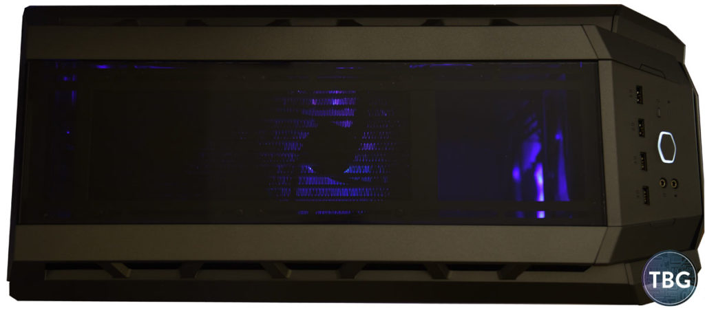
The one concern we have about this case’s design has to do with the mix of materials. Now, we’re not all that concerned that the front and top are made of plastic. If you want this kind of futuristic design, that’s probably the only way to do it, and by the way, we really do dig the starship look of the H500P Mesh. The trouble is that you now have a glass side panel, a steel side panel, a plastic front, and an acrylic top window. By the way, did we mention how we feel about acrylic? Yeah, that top window is going to get scratched the moment you place anything on it, so we actually left the protective plastic tape in place, and we recommend buyers of the H500P Mesh do the same thing. No, it doesn’t look as good as fresh acrylic, but yes, it looks a whole lot better than acrylic that’s been used for a few days! By the way, we know from our conversations with Cooler Master, including at the original H500P’s launch at PAX West 2017, that over the long run, Cooler Master hopes to release an all-glass version of the H500P. At this point, a glass front panel probably won’t be used due to the airflow problems it causes, but a glass top panel is a sure bet. A lower cost version of the H500P Mesh could actually go with, well, you know, mesh up top, and we hope Cooler Master does indeed release something like that, as we think it would be very popular. Maybe drop the RGB fans in front to lower costs further, and Cooler Master would have a true performance per dollar winner.
Performance
Because we’ve recently switched to a new test platform (the Ryzen 7 2700X on an X470 motherboard), we can’t provide comparable CPU temperature metrics or sound results. But we do have some GPU temperature results for our reference GeForce GTX 1080 from two other recent case reviews, so we’ll provide them here to give you some idea of how the H500P performs.
For the sake of completeness, here’s the full component list of the build we used to test the H500P Mesh:
- CPU: AMD Ryzen 2700X
- Motherboard: Asus X470 Crosshair VII
- Video Card: EVGA GeForce GTX 1080 8GB FE
- RAM: Corsair 2x8GB Vengeance RGB DDR4-3000 RAM
- Solid-State Drive #1: Samsung 850 Evo M.2
- Solid-State Drive #2: Crucial MX500 1TB 2.5″
- Power Supply: Corsair HX750 Platinum
- CPU Cooler: Cooler Master MasterLiquid ML240R Liquid Cooler
- Lighting: SilverStone LS02 RGB light strips
- OS: Microsoft Windows 10 Home
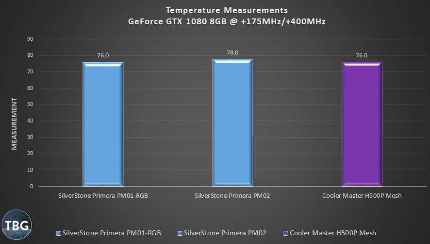
While it’s just one data point, the fact that the H500P Mesh is keeping up with the PM01-RGB, which has held the title as the best case we’ve ever tested in terms of airflow, is a good sign. And that’s to be expected – the H500P has a very similar layout and design strategy. It’s not the quietest case around, thanks to that huge mesh panel in front, but the solid top panel actually does quite a bit to mute the noise coming from inside the chassis, particularly the fans on the liquid CPU cooler we’re running up top. Because sound is directional, designing exhaust vents such that they point to the sides is a bit benefit for acoustics that doesn’t have an outsized effect on cooling.
Overall, we’re extremely happy with the performance of the H500P Mesh. If cooling is what you’re after, this case carries on the proud tradition of Cooler Master HAF cases that came before it. Acoustics are very good too, with one caveat: our sample H500P Mesh used a two-pin fan splitter to power the front fans, which was a terrible (and perhaps inadvertent) choice on Cooler Master’s part. With just two pins, any RPM readings or motherboard fan controls were out of the question. That meant these twin 200mm fans ran at full speed out of the box (which produced 47dB of noise, as we mentioned earlier). While that’s fine under full load, it’s unacceptable at idle. So we simply threw out that worthless fan splitter and plugged each fan into a separate fan header on our motherboard. Now, these fans are 3-pin rather than true 4-pin PWM fans, but any modern board can provide DC controls via a 3-pin connection, so it worked out fine from our point of view. Our Asus motherboard could bring these fans all the way down to 0 RPM at low loads, and quickly ramp them up to their 800RPM maximum when required. We’ve informed Cooler Master of the problem with the fan splitter, and we hope that retail versions of the H500P Mesh will have a 3-pin splitter.
Conclusion
As far as we’re concerned, the new MasterCase H500P Mesh is a home run. No, it’s not perfect, but it gets so many things right, from aesthetics to airflow to expandability, that we have to give credit where credit is due. Cooler Master has worked hard to make the H500P Mesh the case that so many enthusiasts have always wanted. We’ve often remarked to manufacturers that there’s been a lack of case options at the $150 pricepoint. Plenty of models come in around $100, and plenty hit the $200 pricepoint, but few target the $150 sweet spot for a high-end build. Cooler Master has done it, but obviously it wasn’t easy. The original H500P tried and failed to impress, but the H500P Mesh gets it right. The second time’s a charm, as they say!
And while we’ve already mentioned this, we’re going to highlight it again: Cooler Master is the first case and cooler manufacturer to fully embrace industry standards for RGB lighting. Ever since RGB hit the scene about two years ago, it’s received constant criticism from reviewers and consumers alike. But our hunch is that the real problem with RGB’s initial implementation is that it tended to make your PC look like the grand finale of a fireworks show, where an entire box of fireworks is set off all at once! With the advent of 4-pin RGB headers (used by the H500P’s fans) and 3-pin addressable RGB headers (used by the ML240R cooler’s fans), you can come up with some truly cool, synchronized lighting schemes. Special credit goes to Asus as well, which in addition to being the first motherboard manufacturer to embrace RGB lighting, is also the clear leader today in terms of its Windows-based control suite. We set up color gradients that allowed front-to-back waves of color, we set up a pulsing red center with blue exterior lighting to mimic a heart beating, and we also enjoyed the full-on rainbow lightshow that’s available as a default configuration.
As we’ve mentioned, we know Cooler Master is already working on an upgraded version of this case, and a curved front glass panel is probably on the drawing board. But we’d skip that investment and focus on some other more tangible improvements. What’s on our wish list? How about a glass top panel, a glass right-side panel, four RGB light strips placed at the bottom and top edges of the case, an RGB rear fan, and a revised drive mounting system? If Cooler Master could bring all this to the market at $200 or less, it would absolutely dominate the competition.
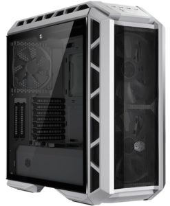
In the here and now, though, we highly recommend the Cooler Master MasterCase H500P just the way it is. The H500P White shown above is available as of our publication date for $149.99 shipped from Amazon, and the gunmetal grey version featured in this review will be released in mid-May 2018. In other good news, the MasterLiquid ML240R Liquid Cooler featured in this review is also available, having just hit the market a few days before we went to press.
We like the H500P so much that we’ve made it our official benchmarking case for 2018, selected it as the “showcase” for our $3,000 Elite RGB Gaming PC Buyer’s Guide, and will soon be publishing a full high-end PC assembly guide using it. In other words, we like it. A lot. As always, to see all of our recommended cases, simply browse TBG’s PC Buyer’s Guides, which highlight our top 24 favorite cases on the market!


